So long, 2014!
2014 certainly was a great year: full of fun and exciting infographic and design projects across all platforms. Here are just a few highlights of KarBel Multimedia’s 2014 year in infographics & design:
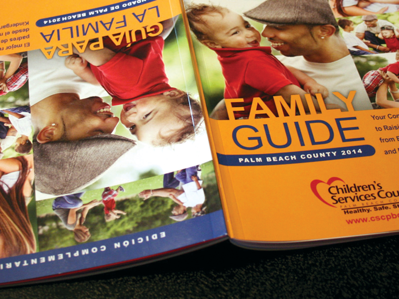
Family Guide
We partnered with the Palm Beach County Childrens’ Services Council on their bilingual family guide, which we wrote, translated, designed, and illustrated the print and web versions. The 50-page booklet is a primer for families who are looking to start or expand and need some help caring and educating the child. The web version has several motion graphics and interactives that bring some of the stories and sections to life, hopefully making these topics more fun and engaging, as well as educational.
See More
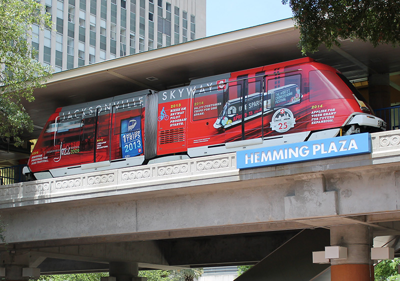
Skyway Train Wrap
We worked with the Jacksonville Transportation Authority to create a special train wrap design for the Skyway’s 25th anniversary. The design incorporates a timeline showing the history of the Skyway system. We also created an accompanying medallion design that served as the anniversary logo, and we were on hand during the unveiling of the 2 trains during the ceremony in downtown Jacksonville’s Hemming Plaza.
See More
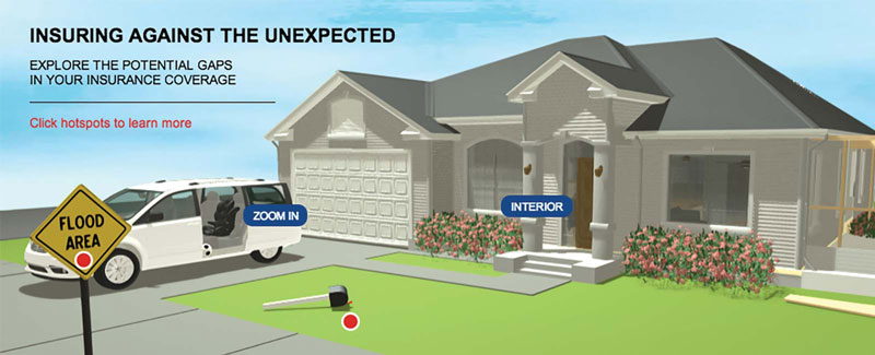
Insurance House Interactive
We were commissioned by T Brand Studio, the custom content studio in the Advertising Department of The New York Times, to create an interactive experience that teaches readers about potential gaps that may exist in their current insurance coverage. We built a simple animation and 3D home that had hot spots to show key parts of a home to which homeowners may need to pay some particular attention.
See Interactive
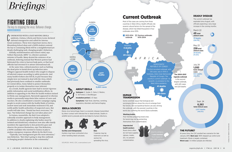
Ebola Infographic
It proved to be a scary time in the world when the West African ebola outbreak began to spread. We partnered with the Johns Hopkins Bloomberg School of Public Health Magazine to create an infographic that explained the outbreak for their fall 2014 issue. We believed that the volume of cases needed to be the highlight of the story, so we focused on two key parts of the graphic to showcase the data. While the death toll grew in key African nations, it was felt that the sheer volume of cases that grew each month was not coming across clearly to readers. So we used comparison circles to show that increase in volume, and the result was a beautiful and simple graphic.
See Online version
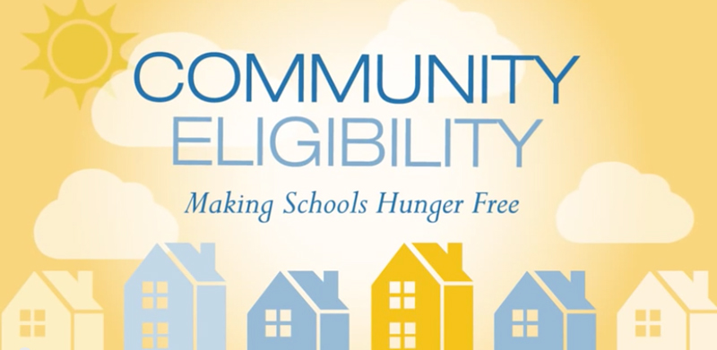
Community Eligibility Motion Graphic
We worked with the Center on Budget and Policy Priorities to create a motion graphic about the government’s new Community Eligibility program that helps low income schools to provide meals free of cost. COBPP’s mission was to educate potential schools about the program, and our task was to make that statement in a fun and engaging way. We created a print infographic first, and used some of the artwork in the animation. We worked with COBPP to hone the story within 60 seconds, which isn’t much time to explain the issue. COBPP says it was a success and well received, so we’re proud of helping them achieve their goals.
See Animation
Infographic Workshops
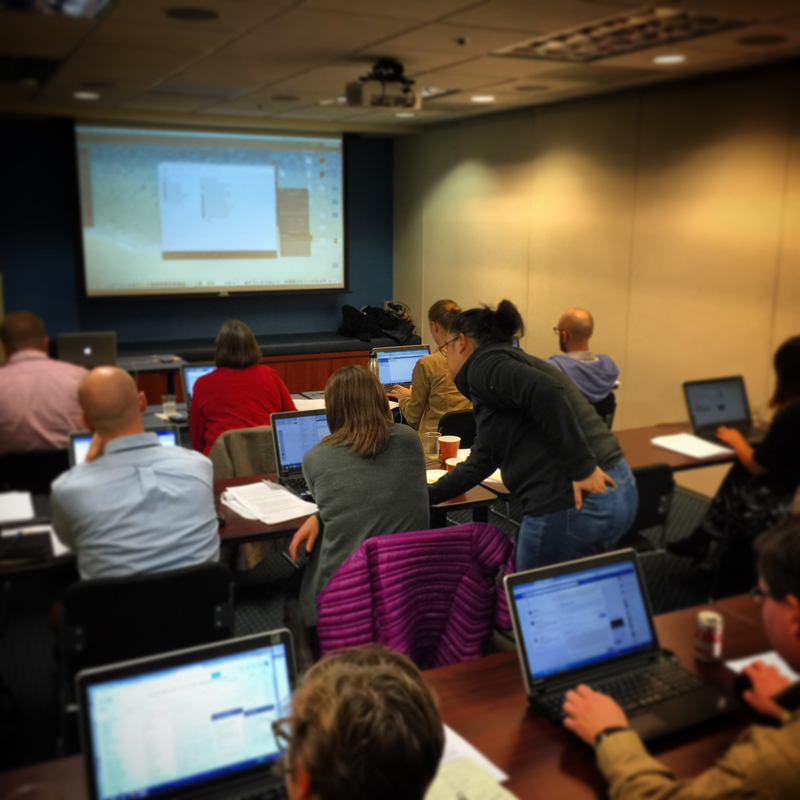
From time to time, we travel to teach professionals how to create simple infographics or use Adobe software to create visuals. In October, we got a taste of crisp fall weather (vastly different from our sunny, humid, South Florida falls) when we traveled to DC for a 2-day workshop. We taught data analysts how to create simple pie, bar, and fever charts in Illustrator in our hands-on workshop. The best part is seeing their imaginations take charge when they start to move on from simple pie charts and incorporate small illustrations or display text to make some easy infographics.
Hello 2015!
We are always excited about the diverse projects we get to produce with our partners and 2014 proved to be very exciting indeed. In 2015, we look forward to helping our partners create their next visual stories. Contact us if you would like us to help you visualize your story too.
See you all next year!
RELATED ITEMS
 KarBel Multimedia 2023 Year in Review
KarBel Multimedia 2023 Year in Review
 KarBel Multimedia 2022 Year in Review
KarBel Multimedia 2022 Year in Review
 KarBel Multimedia 2021 Year in Review


